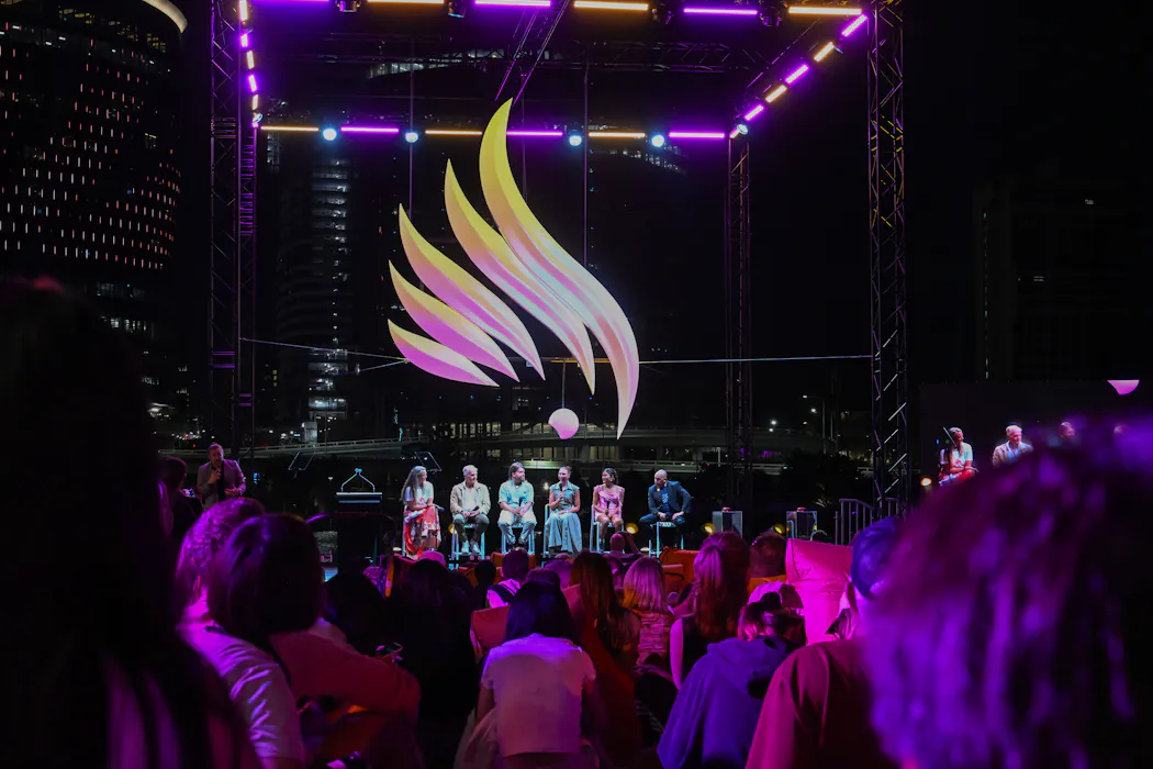
布里斯班2032年奥运会和残奥会的会徽设计近日公布1。该徽标由VML、Verian和BlackCard三家机构共同设计1,融合了粉红色鹦鹉冠羽、火焰和昆士兰州地图轮廓等元素1。值得注意的是,这套设计在官方发布前三天在YouTube频道意外泄露1。
设计分析指出,布里斯班新徽虽然对本地观众易于识别,但在国际辨识度和设计层次方面存在挑战1。与之形成对比的是,悉尼2000年奥运徽侧重标志性建筑和体育元素1,而布里斯班2032年徽则突出自然、地理和文化特征1。设计史上,墨西哥1968年和慕尼黑1972年的奥运徽被专家视为经典范例1。东京2020年奥运徽因抄袭指控被撤回后,组委会通过公开竞赛方式征集替代方案,共收到14,599份参赛作品1。相比之下,伦敦2012年奥运徽的设计费用高达£400,000,却招致超过48,000人的联署反对1。
Brisbane's emblem for the 2032 Olympic and Paralympic Games was unveiled following an unexpected leak on YouTube three days ahead of its official release 1. The design, created collaboratively by VML, Verian, and BlackCard, incorporates a pink cockatoo crest, flames, and the outline of Queensland's map 1. While the imagery effectively communicates local identity and cultural significance to Australian audiences, design experts note that the emblem faces challenges in achieving the international recognizability expected of Olympic symbols 1.
The Brisbane emblem represents a departure from the approach taken by Sydney 2000, which emphasized iconic architecture and sport; instead, the new design prioritizes nature, geography, and cultural elements 1. This stylistic choice contrasts with designs widely regarded as classic by specialists, such as the emblems from Mexico City 1968 and Munich 1972 1. The complexity of layering multiple symbolic meanings—local flora, regional geography, and sporting spirit—raises questions about whether the design achieves sufficient visual clarity for a global audience 1.
The Brisbane emblem's development occurs within a broader context of Olympic design scrutiny. The London 2012 emblem, which cost £400,000 to design, prompted over 48,000 people to petition against it 1. Similarly, Tokyo 2020's original emblem was withdrawn due to plagiarism allegations and replaced following a public competition that attracted 14,599 submissions 1.
评论
还没有评论,欢迎留下第一条。